
[2026 Update] How to Improve E-commerce Site CVR: The Golden Rules of UI/UX for Reaching ¥100 Million in Annual Revenue
When operating an e-commerce site, stagnant conversion rates (CVR) are an inevitable hurdle. No matter how much you spend on advertising to drive traffic, if your purchase rate remains low, your profits will never grow. Methods for improving EC site CVR are more than just simple design changes; they represent a scientific approach rooted in user psychology. In this article, we will provide a thorough explanation of the "golden rules" of UI/UX design essential for surpassing the major milestone of 100 million yen in annual revenue.

Table of Contents (Click to open/close)
1. The First Step in CVR Improvement: Visual Hierarchy Above the Fold
It is said that users take only "3 seconds" to decide whether to stay on a site after visiting. To convince them that "what they are looking for is here" within this short window, optimizing the visual hierarchy is essential. A design is required that makes the most critical elements—the "product value (benefit)" and the "CTA (call to action)"—immediately catch the eye without causing any hesitation.
As the data above indicates, simply optimizing your primary messaging and button placement can dramatically reduce user drop-off rates. Specifically, your copy should speak to the "future" rather than just "features." For example, instead of "a high-performance vacuum cleaner," framing it as "a life where weekend cleaning is done in five minutes" allows you to directly stimulate the user's intent to purchase.
2. Designing a "Zero-Friction" Checkout Experience to Prevent Cart Abandonment
The biggest opportunity loss for EC sites is "cart abandonment." On average across the industry, approximately 70% of users leave the site without completing their purchase, even after adding items to their cart. As an EC site CVR improvement method to prevent this drop-off, it is necessary to eliminate "friction" in the checkout process to the greatest extent possible.
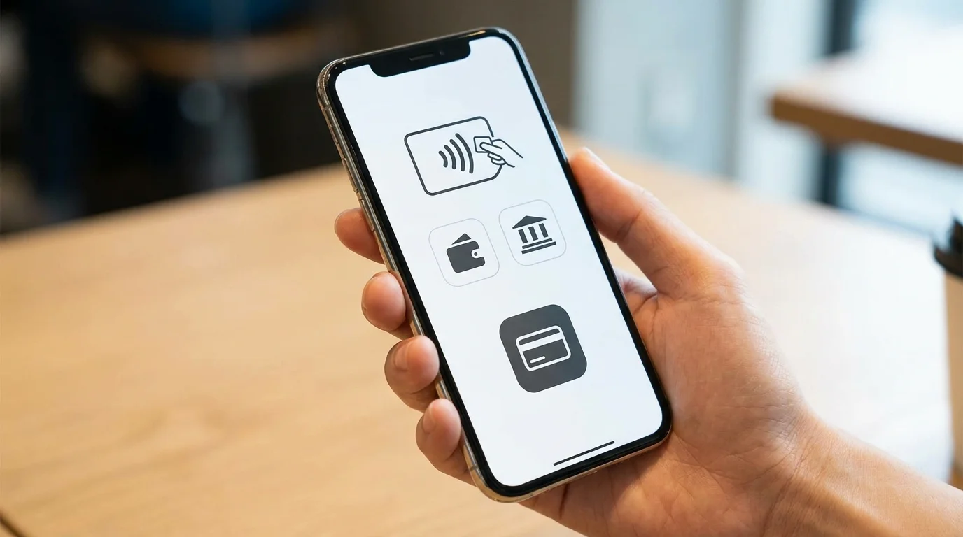
Specifically, implementing "guest checkout" that does not require membership registration and EFO (Entry Form Optimization) to minimize input fields is effective. Additionally, introducing ID payment methods such as Amazon Pay and Apple Pay can directly boost conversion rates by allowing users to skip entering shipping information. The golden rule of UI/UX design is to leave no room for users to feel that the process is a hassle.
3. UGC and Social Proof: Visualizing Credibility
In online shopping, users are constantly plagued by the fear of making a mistake. Social proof is what alleviates this anxiety and gives them the final push. Feedback from other users who have actually used the product (UGC: User-Generated Content) and specific review scores carry far more credibility than advertising messages issued by the brand.

Instead of making the review section a mere list of text, you can encourage users to relate to the product by including photos of the product in use and providing filtering functions based on specific concerns (e.g., 30s, sensitive skin). Additionally, displaying real-time trends such as "X people are currently considering this" or "X items sold today" creates a sense of psychological urgency and contributes to improving CVR.
4. The Shift from Mobile-First to "Mobile-Only"
Currently, over 80% of B2C e-commerce traffic comes from smartphones. The era of building sites that are simply "easy to view on a PC" is over; UI design from a "mobile-only" perspective, where all operations can be completed with a single thumb, is now essential. Button size, text legibility, and image loading speed—each of these factors directly impacts CVR. In particular, page speed metrics such as LCP (Largest Contentful Paint) should be managed as critical KPIs that directly affect not only Google search rankings but also user bounce rates.
FAQ
- Q. Where is the first place to start when improving CVR?
- A. First, focus on the "above the fold" and the "checkout form." By improving these two areas where drop-offs are most frequent, you are highly likely to achieve maximum results (ROI) with minimal effort.
- Q. Will improving the design aesthetics increase CVR?
- A. Not necessarily. Excessive decoration can obscure the hierarchy of information and confuse users. Prioritize "clarity of information" and "ease of use" over "visual appeal".
- Q. How long should A/B testing be conducted?
- A. Ideally, you should wait until there is a statistically significant difference, but at least 2 weeks to 1 month is necessary. Make your decision based on flat data that excludes seasonal factors or the impact of advertising campaigns.
Taking your EC business to the next level
A 1% difference in CVR can change annual profits by tens of millions of yen. Meets Consulting will create a customized improvement roadmap for your company.
Talk to us for a free strategy consultationSummary
The core of EC site CVR improvement lies in removing user "psychological stress" and clearly presenting the "reason to buy." Organizing visual hierarchy, eliminating payment friction, building trust through UGC, and optimizing for mobile. By practicing these four golden rules, the path to 100 million yen in annual sales becomes clear. Start by identifying your site's drop-off points through data.
Published: May 8, 2026 / By: Makoto Takimiya

References
- [1] Nielsen Norman Group: Visual Hierarchy in Web Design
- [2] Baymard Institute: E-commerce Checkout Usability